Showing posts with label Pixel Art Sprites. Show all posts

Thursday, July 02, 2020

Project 12: Chrono Trigger Sprites - Lucca

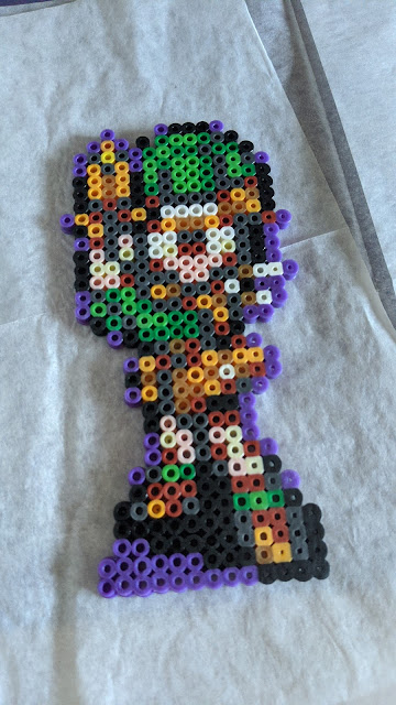
Not even a year later ... I finished the next sprite in my Chrono Trigger Perler Sprites. Everybody, let me introduce Lucca.

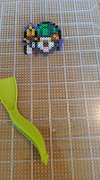
A sprite of Lucca from Chrono Trigger made from fused perler beads.


I managed to work on Lucca much more quickly than I did on Marle so I actually managed to build a bit of a process. I'm hoping I'll be able to quickly move through the rest of the cast. I also got to get a little better at using The GIMP and Omnigraffle, so this feels like a productive project.

The Lucca Sprite


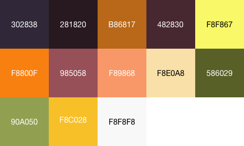
I started by determining all of the colours in the sprite and which sprite colour of Perler bead I would use to match them. I did this by taking the original sprite from The Spriter's Resource and then making a new layer for each colour in the sprite and removing all other colours. I also compiled those colours into the grid below. (I gave them names, but they weren't great names, so I think I'd just use the hex codes next time).


Colour Blocks labeled with the Hex colour codes from the sprite

Colour Blocks labeled with the Perler bead names from the sprite


There's a few cases where I don't have a bead that's a perfect match. Particularly, the Dark Green should probably be Olive and the Bright Green, Fern. Apparently it's about time I put in a new order of beads. I also beaded a test block in the same pattern so you can see what does or doesn't match.

Perler beads laid out in a grid matching the two above


I've broken out all the details below so you can see which colours are which parts of the sprite and how I matched them.


Sprite PartHex ColourPerler ColourNotes
------The Original
#302838PurpleAgain I'm using purple for the "deep shadow" parts of the outline.

#281820BlackThe main outline of the sprite.
#B86817ButterscotchThe (single pixel) highlight on the blaster barrel.
#482830Dark GreyMost of the shading.
#F8F867YellowThe (again single pixel) bright spot on the blaster barrel.
#F8800FOrangeHighlights in Lucca's outfit.
#F8E0A8RustThe leather bits of Lucca's outfit.
#F89868PeachMain skin colour
#801800CremeSkin highlights
#586029Dark GreenHat and sleeve shadows
#F8C028Bright GreenHat and sleeve high lights
#f8f848GoldLeather High lights.
#ffffffWhiteHighlights and her glasses.
You can also download the my .xcf file.

Process

As with the Crono and Marle sprites I decided to do a little addition to make sure that the fused sprite would be sturdy. I also levelled the bottom so that the sprite would stand up right. The only big change that was needed was filling in a couple of sprites on the right side of her face. I wonder if those were a glitch somewhere in my process or even in the sprite.

Lucca sprite, laid out, with two beads by the head highlighted and a wedge to level the bottom.
 

The sprite was pretty easy to build. I did make a good choice in laying out all the necessary beads in the same pattern as the blocks above in a project box.

Perler beads laid out in a bead project box in the same pattern.


I found the easiest way was to work from the top down doing a few beads of each colour at a time. 


Lucca's hat started. Lucca's head finished. The full sprite.


Success of the Sprite

I'm exceptionally happy with how this sprite came out. Part of that is the improved process I've used, so I managed to go from sprite to fused within a week. That definitely kept my the whole project in brain which made it much, much easier. 

The finished Sprite


I definitely need to put in an order to get the beads I'm missing. I generally think Lucca looks good, but a little bit off from how she'd normally look. Olive and Fern beads might have helped with that. Overall I don't think she looks completely off from the other two though.

The one thing I'm not sure about is using purple as that "deep shadow" colour. Given that I *have* dark grey beads now, it seems like it might make more sense to use those in the future. I started with the purple for Crono, which I think worked because there were fewer deep shadow pixels. I'm going to keep on with the purple / black arrangement for the rest of this batch and then I'll come back for a second and see what overall changes I made.

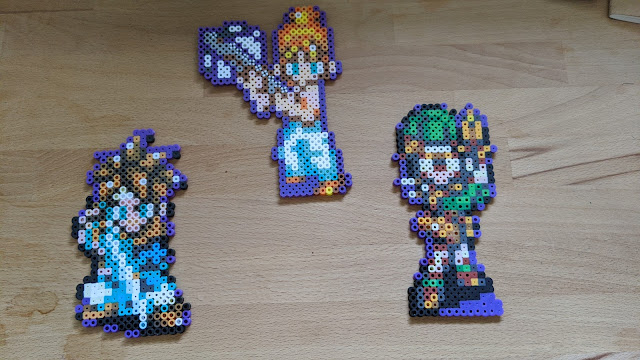
Perler sprites of Lucca, Marle and Crono


The next sprite is Robo and I'd like to wrap it up by July 15, 2020. (I was thinking Frog, but I'm going to wait until I buy a few more green beads.)


Friday, May 29, 2020

Projects Update: May 2020

What happened to May?

Just at the end of April I finished the coaster project and I was feeling pretty pleased with myself. I didn’t get quite through everything I wanted in April, but I was pretty happy. Then it was halfway through May and I had no idea where I was or what was going on. I will say I’ve been enjoying spring for the most part, although there’s been some quarantine weirdness kicking around my brain as well.

Four large exclamation mark block coasters on a small table with a Jaritos bottle on one.
I'm really happy with the new coasters.


I haven’t made a lot of progress on the game tracker and I’ve found it pretty hard to sit down and write, so I’m behind on both of those for now. I’ve also picked up an academic thing I need to finish fairly quickly, so I’m thinking about that too.

Since I haven’t made much progress I’m just going to slide my goal for the game tracker back to June 30. The goal is to have remote storage of data working by that point (along with having tutorial myself on various build systems and remote storage solutions.

I also want to push forward on my Chrono Trigger sprites so I’d like to get Lucca finished by June 15.

Tuesday, August 06, 2019

Project 12: The Chrono Trigger Sprites Live - Marle

Once again, I've made some progress on my Chrono Trigger Perler Sprites. This time I got Marle done.


It's been a long, long time since I started working on these. In that time I've moved at least 3 times trucking an unfused sprite around with me. A little while back I finally fused the Marle sprite, and now that I have a little time and space, I'm going to try to push on. I'd like to finish the 1-to-1 sprites before September and then I'll see if I still want to do the double sized sprites.

The Marle Sprite


Similar to the Crono Sprite, I started by determining all of the colours in the sprite and which sprite colour of Perler bead I would use to match them.

The colours in the Marle sprite and Perler Beads colours


Thanks to the lessons learned on the Chrono Sprite, I produced a map for each bead colour in the form of a separate sprite image (and included the bead colour in the file name, which I really appreciate returning to these two years later). The table of those colours are below.


Sprite PartHex ColourPerler ColourNotes
------The Original
#381838PurpleAgain I chose to outline the sprite in purple which gives a good definition to the outside. Might look a little better with the top and bottom filled in as well.
#f8a838ButterscotchHighlights in Marle's hair.
#584848Dark GreyDarkest shadows on the crossbow.
#807060Light Grey"Metal" in the crossbow.
#f86810OrangeLow lights in the hair, belt and shoes.
#488878 and #205040Parrot GreenTwo sprite colours into one perler colour. Largely shadows.
#f8a8a0PeachPinker skin tone.
#80f8b8Pearl BluePants.
#801800RustShadows and Crossbow Body
#f8d8d0SandSkin tone highlights, a little more beige than the true colour.
#a0a8a8Silver PerlCrossbow highlights.
#f8f848YellowHair highlights.
#ffffffWhiteHighlight pixels and filler for the crossbow.


Success of the Sprite

I made sure that the full bottom of the sprite was level all thew ay across. This allowed me to avoid the problems I had with Crono where he tips over if not propped up on the edge. Possibly not a problem in some applications, but if you want your sprites standing, then they need a consistent bottom row. I think here I added in a little extra purple on the bottom to make it stand (although looking at the purple pixels, I can't really see). I hope that me!from-3-years-ago knew what he was doing.

The other change I made was filling in the crossbow. It's technically empty in the real sprite, but for structural integrity I opted to fill it in so that the sprite would be much more rigid and robust. In terms of looking at the sprite in the real world, you barely notice and I think it still looks good.

I'm quite happy with the sprite. I have it sitting next to the Crono sprite in my office window and they look very good together. I am especially enjoying being able to see them from the garden outside.


The process of putting everything together was a bit rough. This project fell way down my priority list, so the couple of times I jumped back in there was a long figuring out what was going on period. On the plus side, I was much more organized about generating the sprite-part sheets, so building the sprite and putting together this post was fairly straight forward.

My next sprite is Lucca. I haven't started yet, but I'd like to have the sprite finished and the next blog post in the series made by August 23, 2019.


Tuesday, July 21, 2015

Project 12: Chrono Trigger Sprites Update


I'm making progress on the Chrono Trigger Sprites!

He exists!

The first stage of the project I've been working on is to make all the sprites at 1x1 scale to see what they look like and how to build them. As you can see above I've made a 1x1 Chrono and I thought I would devote this post to talking about how I put it together.

Planning the Sprite


One of the things I was unsure about at the beginning of the project (and some of what slowed me down putting things together) was how to make sure that I had reasonable bead colours for all of the colours in the sprite.

I started working on colour matching by separating out all the colours into big visible blocks and then making a spreadsheet with the names of the Perler beads I thought would best match. I separated the colours of the original sprite using GIMP, since I've never used photoshop, but basically any utility that lets you select by colour will do. I picked a colour from the sprite, drew a box of it in another picture then blanked out all the pixels of that colour.

I did the matching in what is probably a dumb way. I basically held beads up to the screen until I thought they were about right. As I mentioned, I've purchased most (it turns out) of the bead colours currently offered by Perler, so I felt I had a pretty good ability to match things.

This is the colour block I used, although I given how much time I spent switching between the colours and the spreadsheet, I've labeled each of the blocks right on the picture. (I'm keeping that in mind for the future).

Why do purple and brown get double the space? I have no idea, sometimes past!me just doesn't leave good enough notes.

To help sort out which beads are which colour I have created colour separated sprites. I've also thrown in the hex code for the sprite colour, the bead colour I matched that to and included some notes on how good the match is.

I didn't do this originally, but I think it may prove helpful in the future. If I were to produce these on a large scale, it might help to create templates for beading. To produce these sprites, I took each colour in the sprite and then blanked out all other sprites. (The sprites should all align to go back together again, but it took me a little while to get the process in, so take them with a grain of salt).


Sprite PartHex ColourPerler ColourNotes
The Original!------
#402038PurpleThis colour is purple, even thought it's basically used as dark grey. I thought it might look odd, but in the end it looks good in the finished sprite. 
#281820BlackThis is close enough to being black that black looks just fine.
#b80038RustRust is a little darker and a little browner than the true colour, but it seems to be a pretty reasonable substitution in the finished sprite.
#580000BrownBrown is a good match here.
#f88800ButterscotchButterscotch is maybe a touch dull, but seems to be a pretty good match.
#a8a870CremaCrema seems to match the beige colour used here.
#f88068PeachPeach is a little lighter than the colour in the sprite, but seems to be close enough.
#083838Parrot GreenThis is a bad match really(Parrot Green is much much brighter than the colour), but a good colour I think. I especially like it as Chrono's eyes.
#f8c898SandIn the finished sprite this looks a little bit too close to the peach skin tone. I might go for something a little lighter.
#307070Dark GreyThe sprite colour is much more green than the grey, but I think this balances the brightness of the parrot green as the main body of Chrono's clothes.
#50d0e8TurquoiseThis looks like a great match to me.
#50f8b8ToothpasteThis one also looks like a good match.
#ffffffWhiteAnd white of course matches the white, I've shown all the white pixels here in purple.


Once I got that done, I got distracted. I actually finished that part of this job more than a year ago, but then didn't get around to actually putting things together until recently. This has made a few things more complicated and I'm especially short on justification for the colour matching.

Anyway after letting most of a year pass, I finally got on to...

Building the Sprite


So a little while ago I sat down to see how to actually put together the sprite.


The first day of work was quite slow. I'm used to the the big fields of the Super Mario Exclamation Blocks, which simply need you to figure out where your edges are and then you can turn your brain off and lay out beads. Here each line has a lot of different colours. I tried to find trails of colour to put in,  so that I'd find landmarks to construct around so that I didn't get lost.

I found while working on it it was also very hard to see any of the pattern emerging. I had to sit back and cross my eyes. In the second and third images you can pretty clearly see Chrono's head and arm, but as I was putting it together it was tough to see. (Why does he have three eyes? Oh, that's his sleeve.)

I ended off the first day about here. With his head and upper body done. The second day's progress went a little faster because there was less colour variation and the sword makes a good landmark to be able to figure out how far down the sprite you are. The harrowing part was adding the second board to bead from and then not messing things up as I went over the gap (which is really not a problem, but I'd never done it before.


Overall it took me two days (maybe 4 or 5 hours total) to bead out the sprite. It was definitely hard than the coasters, but it wasn't awful.

Next it was time to fuse the beads, although I ended up having a small problem first. It turns out its probably safest move the two halves separately, or better yet to put down a board for both halves to sit on.


Fixing the sprite was a little bit of an ordeal because I had to figure out which parts of the pattern were messed up. Fortunately I managed to keep all the beads in the same place, so everything I had had to go back somewhere in the sprite.

Before fusing I also noticed that there were a couple of spots where there was a bead by itself (with only one neighbour. I figured these would be hard to fuse properly, so in each of these three places I added a black bead to support.


Finally I was able to fuse. Unfortunately my iron doesn't have a temperature setting, just a cloth setting, so I can't tell you how hot the iron was other than "cotton". I still don't have a great intuition for fusing, knowing how long it's going to take for the beads to melt and how long the beads should melt to stick together and look their best.


The fuse was ok, although not all I could have wished for. Structurally I'm happy, the sprite is strong and doesn't flex, wobble or feel weak anywhere. I think it could look a little better in the evenness of the melt, but that's not the end of the world. More practice will probably help.

Success of the Sprite


So generally I'm really happy with the sprite. It came out strong and I think it looks really good. My primary concern with the colour plan was that the purple around the outside would be too extreme, but I think your brain automatically ignores it when you see it against a back ground. Alternatively you could easily make the purple parts of the outline dark grey or black.


As you'll notice there's one major problem with the Chrono sprite. He's not that flat on the bottom. I knew this would be trouble while I was putting the sprite together and I thought about building a shadow under his left leg to make him level. Two other options were to make a background for him to stand level on or to make a stand that can hold him up this way. I'm going to stick with the given sprites for the rest of this experiment, but when I get onto stage two I'll revisit and think about how to make them stand better.

Anyway, in the end, I'm happy. I have a good looking sprite kicking around and every time I see it I'm pleased. From here I'm going to make all of the PCs at this 1x1 scale before moving on to bigger ones in phase 2. I've started work on the next one, as I hinted to twitter and I'm happy with the project.


The Books I Read - November 2024

November was a bit weird. The Hands of the Emperor is long, but excedingly good. I'm continuing to find Anna Lee Huber a very engagin...